Technology has changed, we do not write about our successes in words, we use pictures.
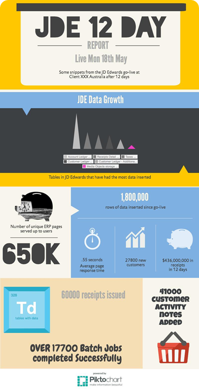
Infographic’s are a nerds choice for not writing paragraphs. I recently completed another go-live and decided to celebrate the usage with a pictochart:
I love a great piece of marketing, I must admit that I think that infographics are awesome for speaking across the many audiences that have something to do with an ERP go live.
Now, I must give a shout out to piktochart.com in their most simple free offering I was able to create a pretty cool visual summary that people could understand. I’ve changed some of the numbers of this form to protect the innocent.
So you can see from the above that there are some really nice pieces of data, some financial and some usage. All of these were easily extracted from a series of database queries and also google analytics. Some of the better statistics of course were gathered from ERP analytics. For instance, we can tell how many ERP pages are loaded per day. How many unique users log into the application per day. We can tell how many times EVERY single JD Edwards application was run and how long they took to load.
We were also able to completely explain to the business that the end user performance was better, as we can tell average page load times per day, week and month. This enabled us to unequivocally tell end user performance HAD improved!
To paint an accurate picture, performance improved, but we went to AWS in the cloud. We went from pSeries enterprise and database servers to x86 linux. We went from websphere to WLS 12C. There was some massive changes!
I think that the in memory 12C database option was the thing that saved us from some serious performance issues.


